Hello! This is the last card from this mini series of CAS cards. Once I did the first one, I knew I wanted to try a few more alternative designs based on the same minimal style. I sure enjoyed creating them.
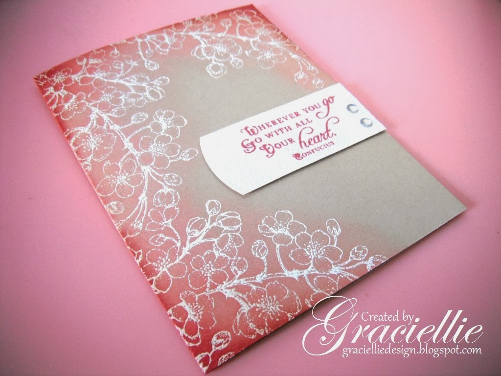
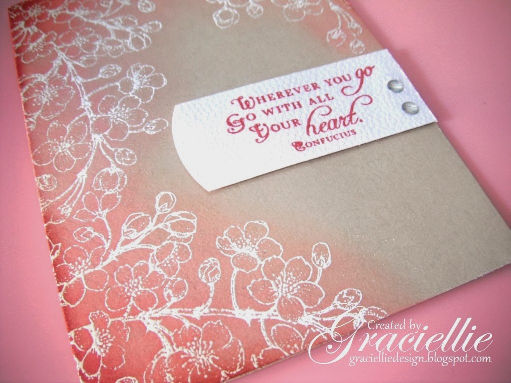
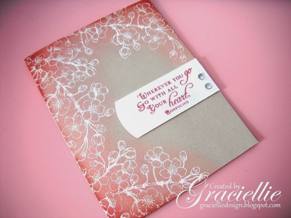
Today’s design is the result of mixing techniques from both previous cards. The image was heat embossed in white. The card was distressed in various tones of pink, but only over the stamped image, creating a contour and blending it towards the center of the card. You can see that I didn’t distress the lower right corner, because I wanted to create and unfinished frame. The card base this time is sand, instead of white. So you may find that it has less contrast, but it still ended up nicely balanced.
Materials
Flourishes – Cherry Blossoms
Ranger:
– Embossing Ink
– Distress ink in Spun Sugar
– Distress ink in Worn Lipstick
– Blending tool
Inkadinkado embossing powder in Clear
ZAP! heat tool
Memento dye ink in Rhubarb Stalk
Imagine Crafts sponge dauber
EK Success Embossed Curve Slim Edger border punch
Bazic mounting tape
Merletto crystal stickers
Other generic materials
White textured cardstock
Sand cardstock
I applied a bit of memento ink in Rhubarb Stalk on the corners to deepen the transition and to coordinate with the sentiment. It ended more like a darker shade of pink, it blended well with the distress inks I used. The white label was handmade and I curved one of the sides using an EK Success border punch.
Hope you liked this card. Let me know what you thought of this series of cards, and if possible tell me which of the 3 is your favorite. I’d like to know!


VERY PRETTY GRACIE!!! I LIKE that Rhubarb Ink!!! 🙂 AND the way you left the bottom corner untouched!!!!:) AND the little tag you created your sentiment for too!!!The Flourishes image is ALWAYS GORGEOUS!!!!:)
WHICH IS MY FAVORITE? I think I LOVE the BLUE!!!! 🙂 Like I said, it reminds me of Chinese Ware, I have a weakness for Asian things!!!:) ALL of your cards are GORGEOUS though!!!!!!!!!!:)
LikeLike
Love those Cherry Blossoms. Thanks for sharing with us at Cards in Envy.
LikeLike
Another beautiful card. Love the way you inked it. I can see this for Valentine's next year. I really love the textured paper, gives it an embossed look.
LikeLike
Lovely creation again Gracielle! Cherry Blossoms is such a beautiful set, I have always had a special spot in my heart for it 🙂
LikeLike
…just spotted your other two cards in the Card Concept Challenge gallery and wanted to stop my and say WOW!!! Just as beautiful as your first card!
LikeLike
Beautiful! I love your design! Thanks for sharing this one with us at Cards in Envy!
LikeLike
Another pretty card. Thank you again for joining us at the Card Concept!
LikeLike
wow!!! another beautiful card, love the fading of the colors!!! Thanks for joining us at Cards In Envy!
LikeLike
All three of your cards are terrific! I really like the subtle shading of the red and pink on this one. Thanks for sharing three of your cards with us at Cards in Envy! I hope you'll join us again soon for another challenge.
LikeLike
Another beauty, Graciellie! Thanks for sharing your work with us at The Card Concept!
LikeLike
Another beauty, Graciellie! I can see that this is your favorite stamp and rightfully so! It is one of my favorites too! 🙂 I am so glad you could play along with us this week at Flourishes for our Timeless Tuesday Challenge! 🙂
LikeLike
Very pretty card! Great design!
LikeLike